How I started working at Builder.io
And how I totally misunderstood what visual programming is all about.
Have you ever complained really loudly about a product, wrote a totally misleading review unfavorably comparing it against its nearest competitor, and then gotten a job offer from the company that makes it?
And then you take the job, fall in love with it, totally forget about that stupid review you wrote eons ago. In the meantime, your crappy review of your employer’s product managed to become the #1 ranked link on Google when you search for “[INSERT EMPLOYER’S NAME] vs. [INSERT COMPETITOR’S NAME]”?
Well, that’s exactly what happened to me with Builder.io.
This is the story of how I came to work at Builder thanks to an embarrassingly wrong comparison that I wrote about their product followed by an ̶o̶b̶n̶o̶x̶i̶o̶u̶s̶l̶y̶ ̶n̶o̶i̶s̶y̶ ̶c̶o̶m̶p̶l̶a̶i̶n̶t̶ in-depth analysis of their docs posted on their forums.
It’s a happy story for me because I found a new career that I love as an Education Engineer that builds on my strengths as a full-stack web dev and as a writer. But it’s also a story about what visual programming — so often misunderstood as “no-code” — is really about and why it’s important to the future of programming.
Frustrations with Webflow, and how I discovered Builder and Plasmic
It was the second half of 2021.
I had recently quit my role as cofounder in a three-person startup and was trying to launch my own micro-SaaS. Just another unemployed software engineer living the dream as a lifestyle startup founder wannabe.
The truth is that I was burned out. It was at that low point when I fell into the same trap that so many burned-out engineers fall into:
Who cares if I don’t care about this product that I’m building? If I could just scale to $10k/mo., set it on auto-pilot, then I’d escape all the drudgery of my life. How hard could it be?
It would take an entire TED talk to explain why that’s a terrible approach to building products. But it did help me stumble upon something that would change the course of my career: visual programming.
You see, even though I was dreaming of micro-SaaS glory, I was so burned out that I didn’t want anything to do with programming. And the worst, most anxiety-inducing part was the prospect of hand-coding all those marketing pages that would let people know what my product was all about.
That’s when I turned to Webflow for help.

Webflow is the 900 pound gorilla of visual website builders. I had worked with Wix and Squarespace before, but those platforms are walled gardens that limit what you can do. With Webflow, you can basically do anything supported by CSS and then some.
I soon found that even Webflow was too restrictive. Their vaunted flexibility only applies to design. You can’t, for example, add a custom component to a Webflow page or design a proper authentication flow.
A whole cottage industry of SaaS products had sprung up around Webflow to address its shortcomings, perhaps most famously Memberstack. But I found their offerings awkward to use because they had to work around Webflow’s fundamental limitations.

Wasn’t there a website builder that would give me a drag-and-drop experience without limiting me in any way? Where I could still build websites — apps, even — as rich as any I had made by hand but with a fraction of the effort involved in traditional programming?
That’s when I found Builder and Plasmic.
What’s special about Builder and Plasmic
Builder and Plasmic are visual website builders. What sets them apart from others is the ability to use your own custom components.
Let’s say you want a landing page. With any visual website builder, you might start with some text and images, which you drag and drop in the form of blocks onto the editing canvas.
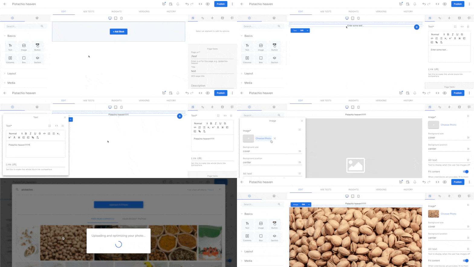
But let’s say you want to add a carousel. Or a feed connected to an external data source. Or an auth widget. Or any of a million possible things that require real code to create.
Builder and Plasmic let you do that by letting you register your own or third-party components. Once registered, you can simply drag and drop your custom components onto your page just as you would with text or images.
Turns out this simple idea unlocks a whole range of benefits. Suddenly, you don’t need to be a programmer to build serious, dynamic, stateful websites with complicated flows. You can have a developer do the initial component registration, and after that, anyone on your team can build without limitation. Marketers and creatives are happy that they can create pages without developer intervention, and developers are happy that they can focus on building new features.

As an engineer who was also learning the role of marketer while building my micro-SaaS, I fell in love with the concept. The only question was which tool to use: Builder or Plasmic?
Plasmic is quite good…
My first impression of Plasmic was highly favorable for two reasons.
First, their UX is amazing.

It’s hard to describe in words, but Plasmic really nailed having a joyful UX and UI. Elements gently bounce around and everything seems to glide effortlessly from screen to screen.
Plasmic’s UX is heavily inspired by Figma, which frankly has one of the best UXes out there. While they’ve toned down the similarities in their UI, the core idioms are still rooted in Figma, which is a great thing. “Good artists copy, great artists steal.”
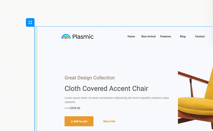
The other area where Plasmic leaves a great initial impression is documentation.
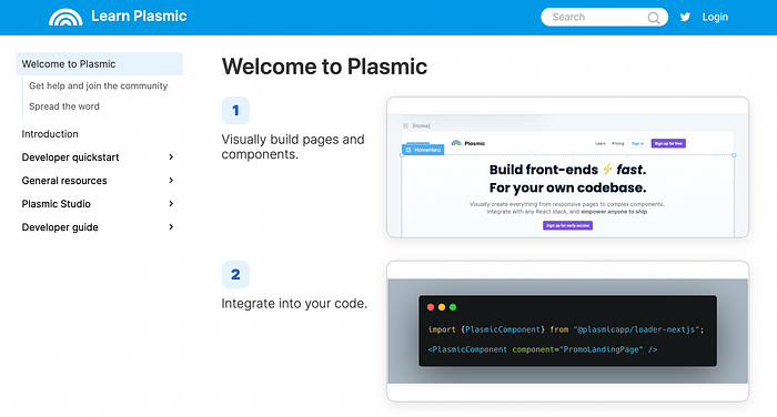
Plasmic’s docs aren’t as voluminous as Builder’s, but they’re crisp, well-structured, and to-the-point. It’s not hard to understand the tool’s mental model and how to get started.
…and also, I totally missed the point behind Builder.
Builder in comparison — and remember, this was in late 2021, not today — didn’t look so great.
I don’t have any screenshots from then, but I’ll share with you this scathing hot take from my review in which I compared Builder to Plasmic:
I’m leaning heavily toward Plasmic right now because the fit and finish is much higher than Builder’s and because I don’t need a built-in CMS. They’ve made some smart choices in their visual editor with intuitive layout features like row/column gap in flexbox. I also know that I’ll need to be writing some custom code for my projects and Plasmic seems better-suited for that task.
The part about fit-and-finish was true. Builder has enormously improved its UX thanks to our talented design team. At the time, though, large parts of the interface were still MVP status.
But when it came to functionality, I wrote stuff that turned out to be hilariously wrong:
That said, Builder is probably the better tool for people who want a truly push-publish-and-forget-it solution, or for folks who want a CMS.
🤦♂️
First of all, I was fundamentally confused about what a CMS, or content management system, is. The only CMS I had used until that point was Wordpress with a brief excursion into Strapi. A CMS in my mind was something that you used to publish blog posts or large amounts of text.
It never occurred to me that all visual website builders are by definition CMSes, the webpages that you create being the content that they manage. Duh.
Second, I didn’t understand that the whole point of using Builder is to integrate it with your codebase.
Builder is so flexible that you can use it as a monolithic “push-publish-and-forget-it” solution where you create, publish, and serve content all from Builder, just like Wordpress. (We don’t encourage it, but it’s possible.) And that’s exactly how I used Builder at first, as if it were just a Wordpress clone.
Seven months later, I can’t believe how misinformed I was back then. Builder is like the Ferrari of visual website development platforms and I was using it as a golf cart. The platform allows an unparalleled level of integration with all kinds of data sources, frameworks, and external services that I totally missed.
And that’s the ignorance in which I wrote my original comparison between Builder and Plasmic. It’s not that Plasmic is a bad product — it’s actually really great and you should check it out! It’s that Builder’s so flexible that understanding its power requires a paradigm shift in how you think about building sites. (More on this later.)
How do you educate engineers about this paradigm shift?
First and foremost, you need good docs.
How I got hired by Builder; or, the importance of doing your research and complaining loudly
Builder’s documentation was very confusing when I first diving into the platform. I spent an entire week deciphering it — time that I should have spent building my micro-SaaS, but I couldn’t help myself. There was something that fascinated me about Builder and I had to make sure that I hadn’t prematurely dismissed the product just because the docs were in a rough state.
My research culminated in a critique that I posted to Builder’s forums, a sample of which I’ve reproduced below:
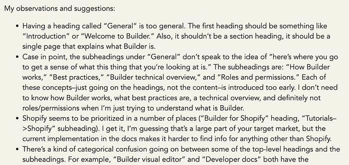
I didn’t expect anything to come of my post other than a sense of catharsis. But then Korey, one of Builder’s OG engineers, as well as Steve, Builder’s CEO and founder, replied:
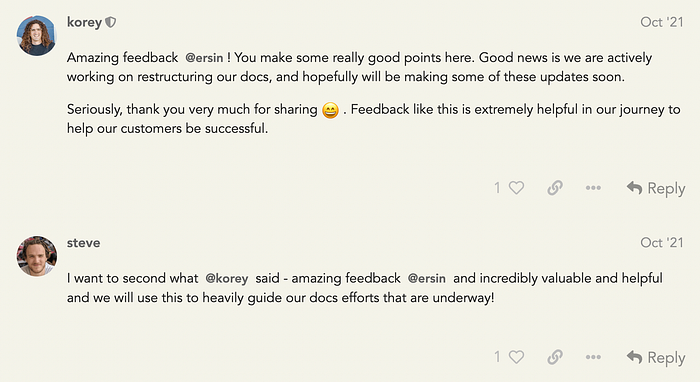
“Seriously, thank you very much for sharing.”
“we will use this to heavily guide our docs efforts that are underway!”
It’s not every day that the CEO of a successful startup tells you that your random rant about an aspect of their product will “heavily guide” their efforts. Or that one of their early engineers goes out of his way to repeatedly thank you.
Unbeknownst to Korey, Steve, or the rest of the team, I was also leaving similar feedback for other startups in the visual programming space. Builder was the only one that took my feedback so seriously, and as I learned once I joined, that’s the norm for the company. Everyone at Builder takes customer feedback this seriously.
Encouraged by Korey and Steve’s enthusiastic replies, I e-mailed Steve, introducing myself and offering a call to further discuss their docs. Steve later told me that he was about to reach out to me, as well.
That call led to an interview, and now I’m an Education Engineer at Builder, where I work everyday to improve our documentation and help others learn. We’ve come a long way in improving our documentation, and I’m proud to be a part of our ongoing efforts. Combining my love of programming with my love of writing has also helped me recover from my burnout.
It’s worth noting that no one held my critique against me when I applied. To the contrary, they loved the honesty and my commitment to improving the product, which speaks volumes about the company’s values and approach to development.
What did I get wrong about Builder?
If you’ve made it this far, you may be wondering what exactly I got wrong about Builder in my original comparison with Plasmic.
I’m planning to write a separate post what makes Builder so great, but I’ll summarize here:
- Builder offers a huge number of ways to access and modify your data. We have not one but three web APIs for fetching and manipulating your content in addition to an admin API for managing your workspace programmatically. We also have an enormous number of SDKs to make working with our APIs a breeze — so many, in fact, that we invented an open source framework called Mitosis that lets anyone write components once and compile them to many front-end frameworks. Kind of like Flutter or React Native but for web platforms.
- The Visual Editor — that’s the drag-and-drop part of our platform — is enormously extensible. You can do anything from adding a new menu to completely white-labeling the entire Builder app.
- Builder’s features encourage a unique style of iterative development that’s focused on fixing the friction between developers and non-developers on a mixed team. The idea is that you start by creating freeform content in the Visual Editor that at first anyone on your team can modify and copy. As your team figures out which content engages your customers, you gradually systematize your content into repeatable UX patterns using templates, symbols, and eventually full-blown custom components. Each feature is a step along a spectrum from least locked-down and scalable to most locked-down and scalable. We don’t force you to adopt this methodology, but our features enable this way of iterative thinking.
- One of Builder’s features in particular, targeting, is a complete game changer. Front-end layouts are traditionally built in an imperative style. If you’re using React, for example, JSX looks declarative, but really you’re saying “render this exact component with this exact data.” In contrast, the Builder way is to split your pages up into multiple UI sections and say “render a hero here, a nav here, and a body here. And by the way, here’s the context you need to determine which hero, nav, and body to render.” That context is what we call targeting attributes, and they’re baked into the platform in such a way that anyone can use them. It represents a paradigm shift from building layouts imperatively to declaratively.
- Builder absolutely loves open source. In addition to Mitosis, we’ve released two projects, Qwik and Partytown, that aim to take web performance to the absolute theoretical limit. Our obsession with web performance carries over into Builder’s main product, where we bake in many best practices by default. You no longer have to choose between building fast vs. building performantly: with Builder, you can have it all.
These features are why I believe that Builder is the most powerful and flexible visual platform for creating highly-performant websites quickly.
I misunderstood Builder and visual programming for the same reason that I misunderstood my own motivations as a burned-out engineer looking to make a quick buck.
The idea isn’t to escape from writing code altogether. The idea is to liberate ourselves: unleash marketers and creatives on your team to build without a developer bottleneck, and unburden your developers from a mountain of “can you please move this div 8px to the right” requests. In the end, it’s not about escaping work, it’s about doing the best work that we can.
Well, that’s my spiel about how I started working at Builder.
If you haven’t tried Builder out yet, I encourage you to give it a spin. We offer a free trial that’s more than enough to get you started, and hopefully our docs will surprise and delight.
And if you liked this post, please subscribe! 🙏
